
Stoat seems steamed at the unending stream of bogus palaeoclimate graphs launched into the Blogosphere by ersatz climate skeptics like Viscount Monckton:

The battle of the graphs provides a learning opportunity says “American Elephants”, and indeed it does, though possibly not in the way they’re thinking.Preemptive photoshopping could help end this unwholesome trend:
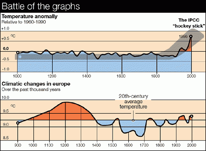
I haven’t been able to clearly identify the source of this image (which is the reason for this post: I’ll show you how far back I’ve managed to go, and your job is to go further, or find a reason why my answer is right). The top pane is clear enough; its a borked-up version of MBH from IPCC 2001 or similar. The lower pane is similar to the famous fig 7.1.c from the FAR in 1990. Wiki’s [[Description of the Medieval Warm Period and Little Ice Age in IPCC reports]] has a nice set of pix.